从油茶网看到这篇文章的转载链接,Caroline Jarrett的疑问,估计也会是众多从事ui行业人士的关注点,该如何适当的在界面表格上摆放按钮位置及按钮命名?仔细阅读了下,慢慢嚼下英文。
Here’s a question that I get asked quite often: “Should we put ‘OK’ button to the left or the right of the ‘Cancel’ button?”
有一个问题我经常被问到:“我们应该把OK按钮放左边,Cancel按钮放右边吗?”
A common variant is to ask the same question with ‘Back’ or ‘Previous’ instead of ‘Cancel’, and to maybe include ‘Next’ in the mixture.
另一个常见类似的问题是“后退”或“前进”代替“取消”,还有是“Next”的混淆情况。
A SIMPLE QUESTION, A COMPLEX ANSWER
问题简单,答案是负责的。
I’d love to tell you: put OK on the left. Or on the right. Or something else that’s easy to say and easy to remember. Like so much in forms, the simple answer isn’t really appropriate. And yet, who needs another ‘it depends’? We’ve got far too many of them in usability. The truth, of course, is that ‘it depends’ is the right answer yet again. But we’ll avert our eyes from that and I’ll try to give a few rules here.
我不喜欢直接告诉你:OK放左边,或放右边,或容易阅读容易记忆等等。多少类似的形式,简单的回答是不妥当。可是,它视什么情况而定呢?在可用性方面我们有非常多的理由来考虑。事实上,它还是取决于正确的答案。转变想法,我试着给出几条规则的建议。
RULE 1: LOOK AT OTHER FORMS
第一条规则:查看、学期其它的表格
The first point is to find out what other forms your users are working with and see where those other programs put their buttons. For example, years ago Jakob Nielsen pointed out that most users spend most of their time on web sites other than yours. Or if you’re creating a program that will be used alongside Microsoft Office applications, then your users are likely to expect your program to follow their conventions. It does get a bit tricky if your users swap regularly between Mac and PC, because unfortunately the two operating systems have conflicting guidelines. Then you’ll have to think carefully about which one you’re going to follow – preferably, after doing some research on what your users do and which applications matter most to them.
第一点是找出您用户正在使用和其他程序的按钮是如何放置的形式。举例来说,几年前Jakob Nielsen指出,大多数用户大部分时间都花在其他的网站上。或者,如果您要创建一个程序,将用于与Microsoft Office应用程序,那么您的用户很可能会期待您的软件适合他们的习惯。一个棘手的问题是,如果您的用户常在Mac和PC之间交换使用 ,因为不幸的是,这两个操作系统有冲突的准则。然后,你就必须仔细考虑清楚哪个系统是你要支持的,然后做一些研究关于你的用户和应用程序之间哪个关系最密切。
RULE 2: PUT BUTTONS AT THE END OF THE CONVERSATION
第二条规则:把按钮放置在会话的末端
The big deal with forms is that they ask users one or more questions, after which the user presses a button to say ‘I’m done with my turn in this conversation’. The conversational turn is handed over to the computer to do something. There needs to be a button. It’s usually called ‘OK’, ‘Send’, ‘Submit’ or ‘Next’. The crucial point is that it goes at the end. One common mistake I’ve seen: putting important instructions, or even whole questions, after that final button. A position that’s invisible to users. Don’t do it.
大规模的对话表格它们向用户提出一个或多个问题,之后,使用者按下一个按钮,说: '我提交我的会话。该会话是交给电脑来做些什么。需要有一个按钮。通常称为‘确定' , '发送' , '提交'或'下一步' 。至关重要的一点是,它不用结束时才点击。我发现一个常见的错误:把重要提示以至整个问题放在最后按钮之后。这让用户忽略了重要信息,这是错误的方式。
RULE 3: DECIDE WHETHER THE BUTTON IS NECESSARY
第三条规则:按钮是否真正必要
A while ago, I wrote a column: “The Piece of HTML created just for me: Reset”. My theme was that ‘Reset’ buttons are rather handy for the forms consultant who regularly hunts for forms on web sites, fills them in and then wants to discard her entries. Sadly, the majority of them are at best useless and at worst deeply annoying for other users. Do you really need other buttons? Do your users want to discard all their work? If you don’t really need a button, then get rid of it.
先前,我写了一篇: “The Piece of HTML created just for me: Reset””的文章 。主题是, 在网站上'reset'按钮对于表格还是较为方便去有规律的进行表格诊断,特别是在用户填写信息后想放弃他的记录。遗憾的是,这对大多数用户而言是无用和烦人的功能。你真的需要另一个按钮?你的用户想要放弃所有的工作?如果你并不是真正必须按钮,果断的去掉它。
RULE 4: DECIDE WHETHER THE BUTTON NEEDS TO LOOK LIKE A BUTTON
第四条规则:确定按钮是否需要像一个按钮形式?
Sometimes you definitely need two or more possible actions at the end of the form: perhaps, indeed, ‘Send’ and ‘Throw away my work’ or ‘OK and ‘Cancel’. Luke Wroblewski calls the most important action the ‘primary action’ and anything else ‘secondary’. He and Etre did some testing on where to put ‘Submit’ and ‘Cancel’ on web forms, and whether to make ‘Cancel’ into a link or a less prominent button.
有时候,你肯定需要两个或两个以上的可能需要采取的行动结束时的形式:也许 '发送'和'放弃我的工作'或'确定和'取消' 。Luke Wroblewski把最重要行动称为“主要行为”,另外的称为“次要行为”。他和Etre做了一些测试,where to put ‘Submit’ and ‘Cancel’ on web forms,,是否让'取消'做成一个链接或做成不太突出的按钮。
Surprisingly, they found that any option that put the two buttons close together worked equally well. The only one that failed was placing ‘Cancel’ right under all the forms fields and ‘Submit’ way off to the right. (An aside: I’d have expected ‘Submit’ right under the forms fields and ‘Cancel’ way off to the right to work just as well as the options where the buttons were all close together, but for some reason that option didn’t get tested).
令人惊讶的是,他们发现,任何选择方式,把两个按钮紧密的放置在一起结果是一样好。唯一个失败案例是在所有表格把'取消'放右下边,‘提交‘离右边距离较远的情况。(旁白:我所期望的'提交'在表格领域的右下,’取消‘则远离右边区域。在这种情况也一起排放是否能起到好的效果,但由于某些原因,这个选择没有进行测试)。
In terms of time to complete the form, an option with two visually similar buttons worked best. It took users a tiny bit longer to deal with the versions where Cancel was less visually prominent or made into a link. Crucially, though, users preferred those options: “People responded well [to options with a less prominent Cancel] even if these designs slowed them down a little. This suggests that they were more concerned about avoiding losing their data, than they were about submitting it quickly”. My take on this: accuracy and user comfort beats a tiny improvement in processing time in nearly all cases. So I’d reduce the visual impact of secondary actions – and probably make really disastrous actions, like ‘Throw away all my data’, into links on web forms.
就完成表格的时间而言,选择有两个类似的视觉效果按钮是最好的方式。在取消不太显眼或制作成一个链接时用户需要花一些时间来做决定。最重要的是,尽管用户优先这些选项: “人们反应良好[去选择一个不太明显的取消]即使这些设计使他们判断慢了点。这表明,他们更关心避免失去他们的数据,相对比快速提交数据而言。 “我接受这个观点:几乎所有的案例中完成过程时间的那么一点点提高被准确性和用户舒适打败了。所以,对于次要行为我减少视觉冲击力——可能产生真正灾难性的行动,如'放弃我所有的数据,进入链接的网页表格。
There’s a supplement to this rule: make sure the button looks like a button. There’s an online banking application that I have to use regularly and it confuses me every time because the buttons are simple rectangles of orange with text on them – none of the little shading tweaks that make buttons stand out and look like buttons. If you’re feeling short of inspiration, try an image search for ‘web button’ and a vast selection of everything from cool to remarkably ugly will appear. Or, more realistically, just have a look at how your favourite web sites do them.
本规则补充:确认按钮看起来像一个按钮。有一个在线银行申请,我经常混淆,因为每一次的按钮是简单的长方形的橙色,他们的文字-没有阴影的调整,使按钮凸出来看起来像按钮。如果你缺少灵感,尝试一个图像搜索‘网页按钮’,会有种类繁多的一切从非常cool和丑陋的都将会出现。或者,更实际,找个你最喜欢的网站学习下。
RULE 5: LABEL THE BUTTON WITH WHAT IT DOES
第五条规则:给按钮贴标识,该如何做?
The last step is to decide what label to put on the button. I’ve so often seen buttons labelled ‘OK’ and ‘Cancel’ when it’s not at all clear what those words mean. Think about those sadly too frequent Cancel boxes: you’ve asked a program to cancel something, and it then gives you a dialogue box with buttons labelled: ‘OK’ and ‘Cancel’. Does ‘Cancel’ here mean, yes, go ahead and cancel or does it mean, no, I don’t want to cancel after all? Note that there’s no rule saying ‘buttons have to have single-word labels’ and definitely no rule saying ‘there has to be an OK button and an Cancel button’. 最后一步是决定按钮上贴什么标识。我常常看到按钮称为'Ok'和'取消',不清楚这些话的意思。想想那些不幸的过于频繁的取消方块:您问的程序,取消什么,然后给你一个对话方块与按钮标签: 'ok'和'取消' 。请问'取消'在这里的意思是,继续和取消它的意思是?不,我不想要取消?请注意,没有规则说'按钮,必须只有一个字的标签' ,肯定没有任何规则说, '必须有一个确定按钮和一个取消按钮。
在网页表格中Luke 关于主要和次要行为的分析
Primary & Secondary Actions in Web Forms
by Luke Wroblewski & Etre
For:http://www.lukew.com/resources/articles/PSactions.asp
In recent months, I’ve been working on refining the design recommendations in my upcoming book, Web Form Design Best Practices, through actual usage data. To that end, I’ve had the pleasure of working with London-based usability firm Etre on several eye-tracking and usability studies focused on specific aspects of Web form design. One of these tests focused on the distinction between primary and secondary actions.
Primary & Secondary Actions
A typical Web form usually enables several “final” actions. Actions like “Submit”, “Save”, or “Continue” are intended to enable form completion –the primary goal of just about anyone who has started filling in a form. Because they enable the most important action on the form (completion), they are often referred to as primary actions.
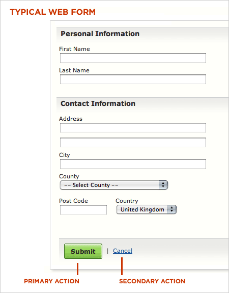
Secondary actions, on the other hand, tend to be less utilized and most often allow people to retract the data they’ve entered. Options like “Cancel”, “Reset”, or “Go Back” represent secondary actions that are counter to most people’s primary goal of completing the form they started.
Because secondary actions can have negative consequences, especially when used unintentionally, I’ve often argued they should be absent from forms. Imagine filling in a long form online only to hit the “Reset” button and have all your data erased.
That said there are situations where secondary actions make sense (“Save for later”, “Export”, etc.). In these conditions, the best practice I’ve advocated has been to visually distinguish primary and secondary actions so people have an clear path illuminating their primary goal: completing a form.
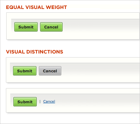
Reducing the visual prominence of secondary actions minimizes the risk for potential errors and further directs people toward a successful outcome. But what’s the best way to accomplish this distinction? How different should primary and secondary actions be and where should they be placed? To answers these questions, Etre and I ran a few tests.
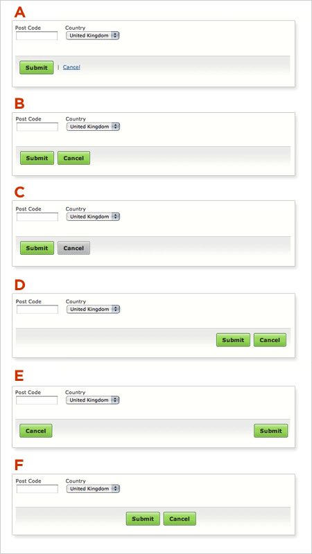
In order to assess which presentation of primary and secondary actions might work best, we tested six variations on 23 people using eye-tracking and usability metrics. Participants were presented each of six designs in random order (to minimize familiarity biases) and asked to “Please complete the form fully and accurately”.
Visual Distinctions
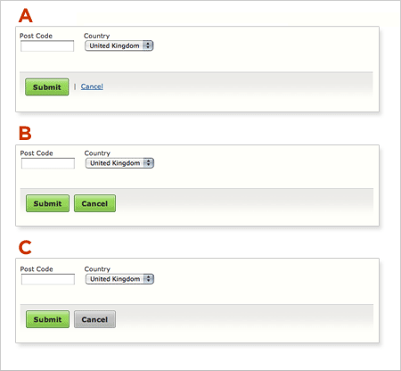
People accomplished their task perfectly when using five of the six designs. Option A, B, C, D and F achieved success rates of 100%, without causing users to make a single error. They also saw comparable task completion times and received similarly high satisfaction ratings.
Option B performed best of all. Fixations were shorter and fewer in number when using this design. And people were also able to complete the task more quickly and efficiently than they did when using the others.
However, when commenting on Option A, several people said that displaying the “Cancel” option as a link was helpful. One person mentioned that, while such a recessive presentation made this option harder to find, it helped prevent accidental (and catastrophic) cancellations. Another felt that “Submit” was the most important option and thus thought it was logical that “Cancel” wasn’t given equal status in the user interface.
Several people also made positive comments about Option C’s grey “Cancel” button. One participant said that its coloring made it easier to spot “the right button” (i.e. “Submit”), while another said that the different colored buttons “slow you down [and] make you check that you are hitting on the right thing.”
Interestingly, people required around eight more fixations to process Option C than they did to process Option B – a design that presented both options as near-identical green left-aligned buttons. It seems that, while users liked they fact that the grey made Option C’s “Cancel” button easier to spot, it did make the design less efficient in terms of its ability to be processed quickly. That said, when using Option B, a number of users expressed concern that they “could quite easily click the wrong one.”
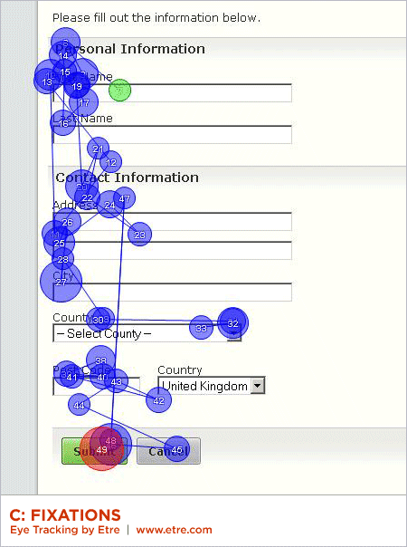
Overall, it seems that people responded well to designs that made “Cancel” stand out in some way – even if these designs slowed them down a little. This suggests that they were more concerned about avoiding losing their data, than they were about submitting it quickly.
Placement
Only Option E performed poorly during our testing. Six people mistakenly clicked on the “Cancel” button when attempting the task with this design, while many more lingered over it before realizing that they were about to make a mistake. People, as a whole, were around six seconds slower when using this design than they were when using Option B (a considerable gap when you consider that the placement of the buttons was the only thing that differed between the two). They also required a higher than average number of fixations to complete the task (with a higher than average total fixation length and average fixation length).
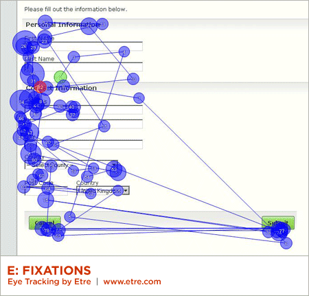
According to the data we collected, Option A, B, and C were the three most effective designs. These prototypes shared a common characteristic: all presented their “Submit” and “Cancel” options on the left-hand side of the page. This suggests that left-alignment of these two options is the best design choice – especially when the form controls above are also left aligned. Placing the “Submit” and “Cancel” buttons on the left meant that people’s eyes had less distance to travel.
In terms of their eye movements, people were least efficient when using Option F. While all people performed the task successfully using this design, our eye tracking data shows that they were more efficient when using the others. People’s fixations were longest when using Option F; they fixated more often on this design than on most others too. We believe that this was because they expected the two buttons to be left-aligned (i.e. to appear directly below the last form field on the page) and upon finding that this wasn’t the case, had to search around to find them.
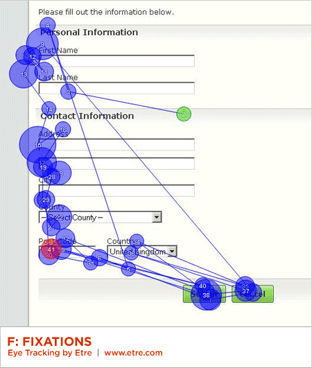
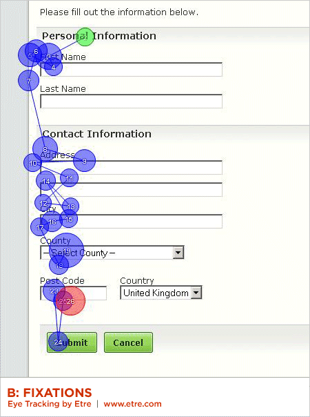
This finding maps well to a long-standing form design principle: illuminate a clear path to completion. Aligning inputs and actions with a strong vertical axis clearly communicates how to go about completing a form. This can be seen by the strong vertical axis formed by people’s gaze paths in the heat map below.
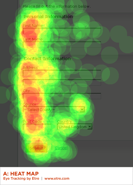
(Note: An element of preconditioning may also have had a bearing here as in all of the other designs we tested the “Submit” button was displayed to the left of the “Cancel” button.)
Summary
While the primary goal of most Web form designs is to get people through a form as quickly and painlessly as possible, there are situations where slowing people down is advisable. When choosing between primary and secondary actions, visual distinctions are a useful method for helping people make good choices.
Should this distinction be more prominent like the button vs. link in Option A or a bit more subtle like the two different colored buttons in Option C? Option A fared a bit better in time to completion, average number of fixations, and average total length of fixations indicating people completed the form faster but not by much.
The need for these distinctions becomes moot, of course, when no secondary actions are present. Make sure you really need each secondary action on a form and don’t add them indiscriminately.
Conversely, the alignment of actions with a form’s input elements provides a clear path to completion that helps people complete forms faster. Be conscious of where you place form actions as primary actions directly aligned with input fields tend to increase completion rates and the less time people have to spend on your forms, the happier they will be.
For more on Form Design...
 Check out Luke's book about Web form usability, visual design, and interaction design considerations: Web Form Design: Filling in the Blanks.
A special thanks to Etre who provided the eye-tracking and usability testing that informed this article.


 Check out Luke's book about Web form usability, visual design, and interaction design considerations:


