以用户为中心的设计 |
这是UCDChina提前预览网页留下的存档,不包括作者可能更新过的内容。 推荐您进入文章源地址阅读和发布评论:http://mysmth2003.spaces.......4E!1346.entry |
||
|
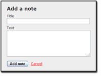
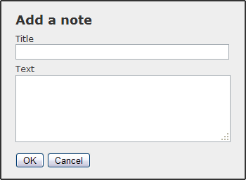
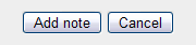
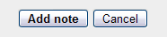
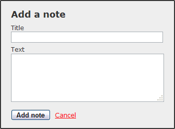
Article copyright by Gabriel Svennerberg 原作者:Gabriel Svennerberg;译者:UCD翻译小组,mysmth2003原文网址:http://www.svennerberg.com/2008/09/the-use-of-buttons-in-web-forms/ According to Jakob Nielsen, the order of the buttons doesn’t matter that much. Both positions has it’s pros and cons. The important thing is to be consistent and if possible follow platform GUI standards [1]. Outside the web world there are GUI standard. The problem is that they are different on different platforms. On the Windows platform the GUI guidelines state that OK should be positioned to the left and Cancel to the right. On the Apple platform it’s the other way around. Luke Wroblewski elaborates on this topic in his article Web Application Form Design [2]. His recommendation is to position the Primary action (OK) aligned to the left part of the form and the Secondary action (Cancel) to the right. He elaborates even further on this topic in the book Web Form Design [3], where he presents the finding from a usability test performed on a form with different designs. What the test showed is that having the Primary action left-aligned and the Secondary action to the right of it makes for the fastest performance Robert Hoekman, jr. has also thought a lot about this and presents his thoughts in the book Designing the Moment [4]. He agrees with Luke Wroblewski that the Primary action should be left-aligned with the form. The reason for this is that this forms a nice line for the eye to follow, working it’s way down the form, thereby making it easy to scan. Another reason is that if the user is navigating the form with the tab-key, the Primary action comes before the Secondary action in the tab order.
Robert Hoekman, jr. also have some thoughts about the labeling of buttons. Instead of just labeling the buttons OK and Cancel it’s better to label them after what they actually do [4]. If it’s to save a note, then why not label the OK-button “Save note” instead. Jakob Nielsen also recommends using a label that explains what it does instead of just a generic label [1]. By doing this the user is more confident using the form since he knows what to expect when he pushes that button. 另一件事是Robert Hoekman,jr.讨论视觉上区分动作,使得用户能够很轻松地做出正确的选择。 Luke Wroblewski也推断出,做首要的动作要比次要的动作更突出。在易用性测试的调查中,他发现如果首要比次要动作有一点不同的设计的时候,用户会花多一些时间去完成表单。而另一方面,用户会更有信心,较少做出错误的选择。他建议使用不同颜色制作按钮或者让次要动作变成一个普通的链接。 一个简单的方法从视觉上区分两点:我经常去做,则使用粗体(bold font weight),放在首要动作上,而一个正常的字体放在次要动作上。 One other thing Robert Hoekman, jr. discusses is to visually distinguish the actions making it easier for the user to pick the right one. Luke Wroblewski also concludes that making the Primary action stand out more than the Secondary action is a good thing. In the findings of the usability test, he finds that it takes the user a little more time to complete the form if the Primary and Secondary action has a different design. But on the other hand it makes the user more confident and less prone to choose the wrong one. He suggest making the buttons in different colors or making the Secondary action a plain link. A simple way to visually distinguish the two that I sometimes do, is to use a bold font weight on the Primary action and a normal font weight on the Secondary. Robert Hoekman, jr.推荐“对次要动作使用一个普通的链接”,他的理由是说这可以更清楚的判断谁是首要的。但是它也适用于费茨法则,即距离和目标尺寸设多大可被触及并且点击——目标越大会越快些(被触及、点击)。首要动作因此应该比次要动作大一些。 Robert Hoekman, jr. recommends using a plain link for the Secondary action [4]. He’s arguments for this is that it makes it clear which one is the most prominent. But it also applies to Fitt’s Law, which suggest that the distance and the size of a target determines how long it takes to reach it and click it. The bigger the target the faster. The Primary action should therefor be bigger than the Secondary action. 在多数情况下,这个按钮最好是完全不用。所有经常错误点击复原按钮的用户因此会删掉他们输入的一切内容。(我在Confusing Northface contact form中写过),并且认真地说,你需要多频繁重设一个整个的表单,并且如果你这么做,会产生怎样的问题? The Reset button is used to reset an entire form. It was pretty common in the early days of the web but is rarely seen nowadays. Nevertheless I thought I would say a few words about this button too since when it appears in a form, it’s usually paired with the Primary action. In most situations it’s best not to use this button at all. All to often users click the Reset button by mistake thereby deleting everything they’ve entered. (I did it as I wrote in Confusing Northface contact form) And seriously, how often do you want to reset an entire form, and if you do, how hard is it? The risk with this button is simply to big compared to the possible benefit of it. Plus in most cases it just adds more clutter to the form. Or as Jakob Nielsen put it in his alertbox column Reset and Cancel Buttons [5]: The Web would be a happier place if virtually all Reset buttons were removed. This button almost never helps users, but often hurts them. 可能唯一的时间是当复原按钮被请求的时候,是当一个表单被同一个用户重复使用的时候,并且每次输入的信息是不同的。 关于复原按钮Luke Wroblewski有一个想法,他认为如果你提供一个也应该提供一个撤回(undo)选项。用户点击复原按钮重新恢复表单,可以起到撤回的作用。此举意味着你不得不暂时的存储表单数据,但为用户的方便提供了很小的价值。 Possibly the only time when a Reset button is called for, is when a form is used repeatedly by the same user and the information entered differs from each use. Luke Wroblewski has an idea about the Reset button [3]. He thinks that if you provide one you should also provide an undo for it. By changing the Reset button into an Undo after being clicked the user can restore the form. This means that you have to temporarily store the form data, but that’s a small price to pay for the convenience of the user. 基于以上所有的观点,加上我使用并设计web表单的经验,我提出一些好办法。 Taking all of the opinions above in consideration, plus my own experience in using and designing web forms, I’ve come up with these best practices. 把按钮放在表单的左边,可以使得眼睛跟随一条清晰的路线。通过首要动作放在次要动作的左边,也便于tab次序。Having the buttons aligned with the left side of the form makes a clear path for the eye to follow. By putting the Primary action to the left of the Secondary action it’s also positioned first in the tab order. 通过描述实际动作发生,用户更舒适的感受他期待使用的内容。By describing what the action actually does, the user feels more comfortable using it since he know what to expect. 这样可以让用户更轻松选择他们想要的选项,而不会从一堆选项中艰难的发现。This makes it easier for the user to choose the option that’s most likely without making it harder to find the other option. 复原按钮经常会伤害用户,而不会太多帮助他们。唯一的可能是他们在表单中需要它们,是同一个用户反复再三做不同输入的时候,即一旦你使用了“复原”,也就意味着为用户提供了一个撤回功能。Reset buttons often hurts user more than it helps them. The only time it’s called for is in a form that the same user uses over and over again with different input. If you use a Reset, also try to provide an undo function. Do you agree with my conclusions or do you have a different opinion about this? Please share! 原文网址:http://www.svennerberg.com/2008/09/the-use-of-buttons-in-web-forms/
|