以用户为中心的设计 |
|||
|
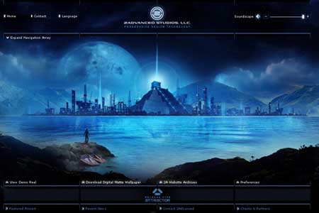
在工作中是否遇到和产品经理意见不合的时候?自己的创意得不到肯定?我在网上发现了一篇文章,主要讲得就是设计师和商务人士交流的问题,思路清晰并很系统。 我翻译了一下,希望对各位同行有所帮助。(上为Brian Armstrong 原文,下绿色为我的译稿) You may have noticed that in certain business and marketing circles there exists a “backlash” against the design community. Despite the rise of attractive, user-friendly solutions, in such circles unattractive designs have somehow managed to remain at the verge of acceptance. You’ll hear ideas being thrown around like “design is a waste of time — we have a really ugly site which outsells our competitors 3 to 1″ or “we are not worried about the design, we’ll outsource it or use a free Wordpress theme, let us focus more on the product”. 您可能已经注意了,一些商务人士对设计存在着一种抵触。尽管视觉效果和可用性逐渐提升,仍有一些设计难被接受。您会在周围听到“设计就是浪费时间,即使网站很难看,我们的销量仍然是竞争对手3倍。”或“我们并不担心设计,我们可以将它外包,或使用免费的WordPress主题,让我们更专注于产品吧。”之类的看法。 You can almost sense a little bit of pride in how ugly their web-site is, or that they are treating design like a commodity. However off base these types of thoughts might be, there is clearly a lack of respect for designers in the business community at times. I’d like to address how you can shatter this barrier and talk to business folk in a language they understand. 当接触他们丑陋的网站,以及把设计看做商品的态度后,您可能会有一点不屑。但您不应有这样的想法,他们这样是因为确实有时缺乏对设计商业作用的重视。下边我来教您如何清除这一障碍,用他们理解的商业语言与之交谈。 This article provides you with 5 guidelines you can use as a designer to “speak business” — even if it’s just to get your foot in the door or land a big project. 本文会给您5条准则,您可以把它们当作“设计师谈商业”,即使这只能让您在一个大项目中插上一小足。 1. Pretty doesn’t mean effective: statistics are your friend!1 漂亮并不意味着有效:统计资料才是您的朋友! Designers like to show off portfolios. It can look stunning, but business people like to see numbers. What was the conversion rate on that opt in? What was the bounce rate and average time on site? What was the most clicked on link from the home page? 设计师喜欢炫耀作品集,它可能看起来很炫,但是商务人员更看重数字。什么是转换率?什么是跳出率和平均网站停留时间?主页上点击次数最多的链接是什么? To a business person, “beautiful” or “visually stunning” are just a first step. They only really matter if “beautiful” or “visually stunning” turns into more sales. Probably the worst offender here is the classic “all flash” site that is gorgeous and completely impossible to use or update. Everything has a cost/benefit trade off, and that includes design. 对于商务人员,“美丽”或“逼真”仅仅是第一步。他们唯一真正关注的是“美丽”或“逼真”怎样转化为更多的销量。也许最明显的案例就是经典全FLASH网站,绚丽但是完全难于使用和更新。一切事物都要考虑投入产出比,当然也包括设计。 Compare these two sites for a moment. The first is from 2Advanced Studios and includes some fancy animation. 对比下面两个网站。前一个是2Advanced工作室的,上面有一些绚丽的动画。
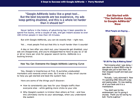
The second is from Perry Marshall, who sells a book on Google Adwords. 第二个是 Perry Marshall的,他在卖一本关于谷歌广告的书。
Despite being uglier, we can probably agree that Perry’s site is significantly better at getting new customers. It may not be better in other areas, but it all depends on what the goal of the site is. Speaking of which…
尽管有些难看,但我们或许可以认同,Perry的网站在招揽新顾客上明显成功很多。一个网站在别的领域不出色无所谓,重要的是要实现建立目标。下面谈到这里... 2. Every design should have a measurable goal2 每个设计应该有一个可衡量的目标 Saying that the goal is to “build the brand of XYZ” or “create an online presence” is basically meaningless to a business-minded person. A goal is only a goal if it is measurable. 如果跟商务人士说,目标就是 “建立某某品牌” 或 “创建线上资讯” ,那是毫无意义的。目标只有一个,那就是可衡量(让我想起了柯南。。There is just only one turth!)。 What are some good examples of a measurable goal? Generating leads, making sales, number of phone calls, opt-ins, subscribers, incoming links, PageRank etc. Instead of trying to convince them that “attractive visual design of this sign-up form would attract more visitors” present them real numbers such as “in the past this design solution effectively increased the conversion rates by 35%”.
一些关于可衡量目标的好例子有哪些呢?寻找线索、销售、来电数量、“单向确认”邮件列表、订阅、网站的导入链接和PR值等。不要试图说服他们,比如“出色的视觉设计会吸引更多用户注册”,而要有真实数字,比如“使用这个设计方案以来,转换率提高了35 % ”。
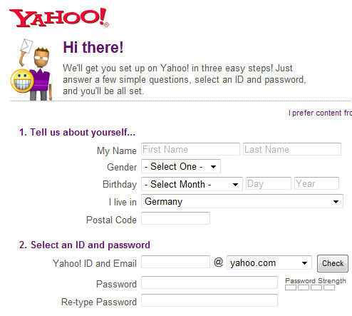
According to Luke Wroblewski’s findings in his book “Web Form Design: Filling in the Blanks”, one single design decision related to the design of sign-up forms has increased the conversion rates up to 40%.
据Luke Wroblewski在其著作《网页窗体设计:填空》的调查结果 ,一个有关注册形式的设计决策提高了40%转换率。 Try saying to a business person: “we split tested this design, and A converted 21% of subscribers while B converted 38%, and our confidence interval on this data is very narrow”. Now you are speaking their language! 尝试和一个商务人士说:“我们用两种方法分别测试了这个设计,甲带来了21 %的用户转换,而乙是38 %,我们对于这个数据的可靠区间太狭小了。” 现在您就在以他们的方式说话。 Try to get inside the head of a prospective customer. Imagine them with a burning pain or question, frantically clicking back and forth on the first page of Google results that came up. Realistically, they are making a decision whether to stick around or try the next result after scanning your site for about 1 second. This brings me to my next point… 尝试进入潜在用户的脑中。想象一下,他们承受着焦躁和困扰,疯狂地从搜索结果的第一页跳来跳去。实际上,他们在网站停留大约1秒钟后,正在决定是坚持,还是尝试下一个结果。这让我想到我下一点... 3. Your site should have one clear path
3 您的网站应有一个明确的路径 As a customer comes to your site, you want to be in complete control of the 1st thing they see, the 2nd, the 3rd, and all the way down until they accomplish your goal that you’ve set. In other words, they have entered your sites “funnel” or “chute”. 一个到您网站的用户,您想完全控制他们第一眼看什么,还有之后一切操作流程,直到他们完成了您设定的目标。换句话说,他们已经进入了您网站的“漏斗”或“通道”。
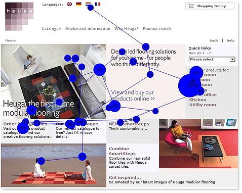
Research
results from an eye-tracking study: users satisfice — they click the
first possible solution that is easily presented to them and may lead
to their goal. Source. 一个眼球追踪的研究结果表明:用户满足 — 他们更倾向于点击“显而易见且能实现目标”的位置。
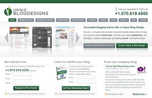
The typical method of giving users lots of different options on a page has been tested and it doesn’t work as well. People don’t want to think hard to figure things out. Users satisfice — they want the first possible solution that is easily presented to them. You should be in control of things in every step of the way, and miraculous things happen when you start to think of your site as a set “process” instead of a maze of options. 典型的方法就是向用户提供许多不同的设置,测试发现这并不可行。人们不想动脑去想事情。用户满意解决法 — 他们希望最佳解决方案轻易呈现眼前。您应该控制操作的每一步,当您把网站看作一整套“操作流程”时,奇迹的事情就会发生 ,不要再用一个迷宫般的设置了。 Please take a look at the first page of this site (the screenshot is displayed below). Really, go ahead and do it and then come back. I’ll wait. 请看一下这个网站的首页(截屏在下边)。去吧,尝试一下再回来,我在这等您。
Well, so you looked right? Let me guess the exact order that your eyes went on the page. First you went to the top left for the site title and logo, then after flicking past the phone number for just an instant you went down to the main headline about “Successful blogging starts with…”. Finally, you skimmed the portfolio and then read the two sub-headlines “Get Started Now” and “Learn to market your blog”. Was I close?
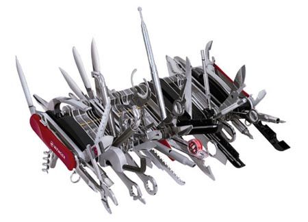
嗯,您看完了吧?让我猜猜您的浏览顺序。首先您会看左上角的网站名称和标志,然后扫了一下电话号码,马上您就到了主标题“成功的博客开始于... ”。最后,您略过了作品集,然后阅读两个分标题“立即开始使用”和“学习市场化博客”。我说得对么? Look at your own site and stand back 10 feet from your monitor. What still stands out on the screen? These are elements that can jump out, with contrast, negative space, etc to help you control where people’s eyes go. There is even some great research coming out on eye tracking. The point is that you can design with this information in mind to guide exactly how people experience your site for the first time and avoid trigger happy back-buttoners. 后退到距离显示器10英尺的 位置,看看自己的网站。还有哪些在屏幕上很突出?他们都是一些显著的可以引导用户浏览顺序的元素,而差些的网站却不能做到这点。如今甚至出现了一些专门关 于眼球跟踪的研究。您可以在设计过程中将这些信息铭记在心,当用户第一次使用网站时,精确引导他们,而不是让他们乱点一气。 4. Remember the swiss army knife4 记住瑞士军刀 One of the best analogies I’ve ever heard about design came from Marissa Mayer at Google. She said that Google tries to think of its design like a Swiss army knife. It has tons of features neatly tucked away inside, but you don’t see them all at once. A first time user might come to the site and just the main knife is flipped open. It’s immediately clear what the main benefit and purpose of this thing is: it’s a knife. But for the advanced users, a little thumbnail catch is still visible so they can slowly start to pull out lesser used features when they’re needed. 在谷歌工作的Marissa Mayer说 过一个比喻,那是我听过关于设计最好的一个了。她说谷歌试图将自己的设计想象成一把瑞士军刀。它工具齐全,整齐的收在内部,您无法一次看到它的全部。第一 次进入网站的用户看到的网站,就应像翻开刀部分的瑞士军刀,它的主要作用毫无疑问只是一把刀子。但是对于高级用户,极小功能都会注意,如果需要,他们自会 像打开瑞士军刀那样去慢慢发掘。 Many people’s web-site are like a Swiss army knife with every damn tool in there pulled out and exposed. “What the hell is this site for?”, a first time visitor might wonder. And like that, you’ve lost them. They’ll check the next result on Google. 很多人的网站就像一个打开所有工具的瑞士军刀。“这个该死的网站想要做什么?”一个初次使用者产生了这样的疑问。如果这样,他们会去搜索其他结果,而您也就失去了他们。
Think of an effective design like a Swiss army knife. It has tons of features neatly tucked away inside, but you don’t see them all at once. Source.
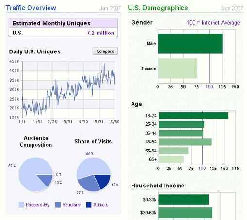
有效的设计就像一把瑞士军刀。它工具齐全,整齐的收在内部,您无法一次看到它的全部。 Keep the site simple with a clear path and purpose. Extra stuff on the page actually does have a detrimental effect in terms of confusion and distraction. Be adamant about eliminating unnecessary pieces of a design. 我们一定要让网站简单明了,具有明确的功能和分类,多余的内容只会让用户产生混乱,坚持“删除不必要的功能”不动摇(哈哈~)。 5. Provide performance metrics5 提供性能指标 Finally, if you really want to impress business people, put together a little report of how a design performs. It doesn’t have to be fancy — maybe a little spreadsheet (those business types do love Excel) with some basic metrics you can pull off of Google Analytics like visitors, time on site, most popular funnel path, and even a goal conversion rate. 最后,如果您真的想给商务人士留下深刻印象,就向他们提供一些设计流程。并不要求多绚丽,一个具有基本指标的电子表格就可以(他们这种人很喜欢Excel),里边包含诸如访问者、网站停留时间、最常用路径,甚至是目标转换率。
A spreadsheet with some basic metrics about like visitors, time on site, most popular funnel path, and even a goal conversion rate can make the difference. Example: Quantcast. 一个具有基本指标的电子表格(里边包含诸如访问者、网站停留时间、最常用路径,甚至是目标转换率)可以让问题迎刃而解。例如: Quantcast 。
Just putting in a little bit of effort here will instantly distinguish you from all the other designers out there who would never think to do something like this. Whoever your client is will be much more likely to say to a colleague, “you know they just get it, they not only design but they understand the purpose behind what we’re doing, I really like that.” And boom, you’ve got a referral to grow to the next level. 只要付出一点点努力,就会立即将您同没有意识到要做这些的设计师区分开来。无论您的客户是谁,他们都很可能和同事说:“知道么?他们做到了,他们不仅了解设计,还了解为什么这么设计,我很喜欢。”您一下就上升到了一个更高的水平。 Conclusion结论 This article may offend some designers. You may think it’s off topic, not your concern, or counterproductive to good design. That’s fine — take what works for you and leave the rest. 本文可能会得罪一些设计师。您也许会认为它跑题了,或者不关您的事,甚至会影响您。那么好,您大可以不考虑这些事情去忙您的工作了。 Speaking in a language the customer understands is key to good communication in any business. Whenever you get deep into a field and become an expert, it’s easy to lose sight of the fact that the rest of the world doesn’t think like you. “以客户理解的语言同他们交谈”是任何商务交流的成功之道。只要您深入到某一领域,并成为一个专家,就很容易会忽视一个事实 — 其他人并不像您那样思考。 Take doctors for instance. They go through so much schooling and learn so much science that it literally sounds like they are speaking a different language if you see a group of them together. But when it comes time to talk to the patient and explain what’s wrong with them, they switch gears and speak in a language the customer understands. 以医生的实例。他们在漫长的学习生涯中学了很多医学知识,如果您看到他们在一起谈话,会感觉他们在讲专业术语。但当他们同病人谈话告诉他们病情时,就会用通俗的语言。 As a great designer, you can do the same thing and become that much more effective in bringing value to your customers. 作为一个杰出的设计师,您可以做同样的事情,并在给用户创造价值方面更加权威。 About the author关于作者 Brian Armstrong is an entrepreneur who also enjoys studying design. He writes about topics such as UI design, building web companies, and how to quit your 9-to-5 to work for yourself at his blog. Brian Armstrong是一位热爱设计的企业家。他在自己的博客里写了许多文章,比如关于用户界面设计发面,如何建立网络公司,以及如何避免朝九晚五的工作等等。 |

